
EveryMundo’s monthly activity emails are a set of emails sent to customers once a month with informative data on how their EveryMundo products are performing. One page includes tables, charts, quick links, customer resources, and more. It dynamically generates the data each month and compares it to the previous month. The data offers insights into the performance of customers’ products and provides suggestions for improving them.
Goal
Aggregate our internal analytics to create an informative automated email that includes a call to action to further promote user engagement.
Prerequisites
- Various platforms, including Google Analytics, AWS Redshift, and AWS Athena, store customer analytics. The Data Analytics team required a method to aggregate all this data and incorporate it into an email.
- You need to fully automate the email and send it out every month.
- You must link the email to the customer database, ensuring that the recipient list updates when a new customer is added or removed.
- The data on the page should be informative and captivating without overwhelming the email with excessive text.
Tech stack:
- Sendgrid – Email platform (Allows for custom email templates with injectable data using their API)
- Quickchart – Chart.js image generation
- Node.js – Runtime environment
- AWS Lambda – Serverless platform for email logic
- AWS SQS – To manage the queue of customers for email generation
Planning:
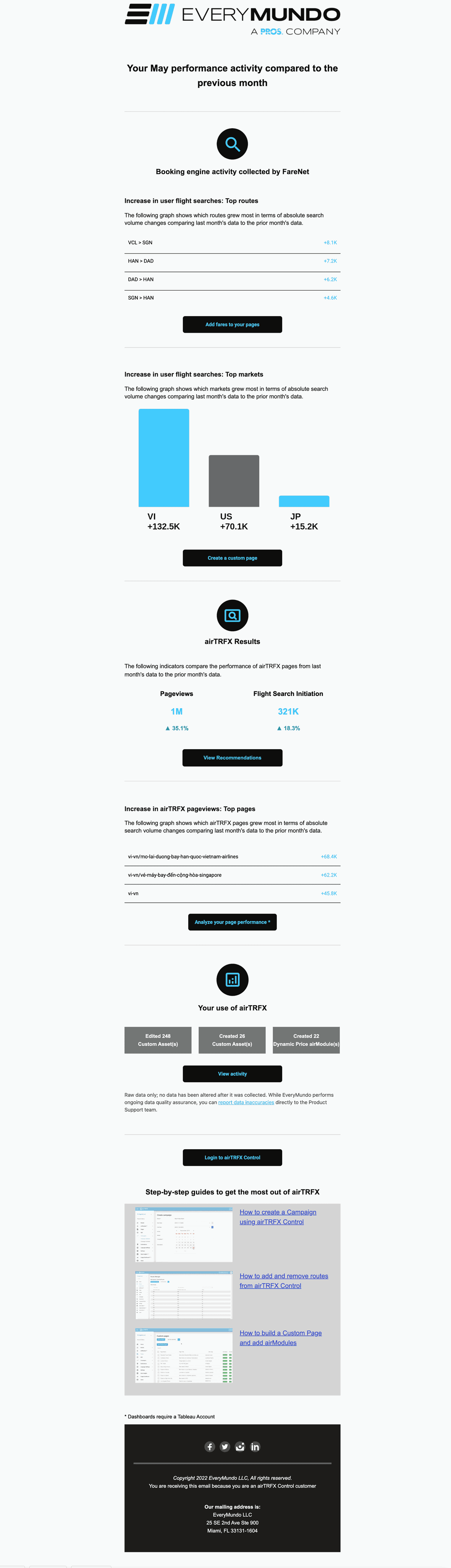
Because the team utilizes Lambdas, they had to divide this task into two parts: a trigger lambda and a sender lambda. Lambdas have a 15-minute runtime limit, making it impossible to incorporate all the functionality into a single lambda. Therefore, the team chose to use one lambda to collect the list of customers through an internal API and then push the customer list into an SQS queue. This queue would subsequently serve as a trigger for the second lambda to aggregate and send the emails individually.
Data Flow
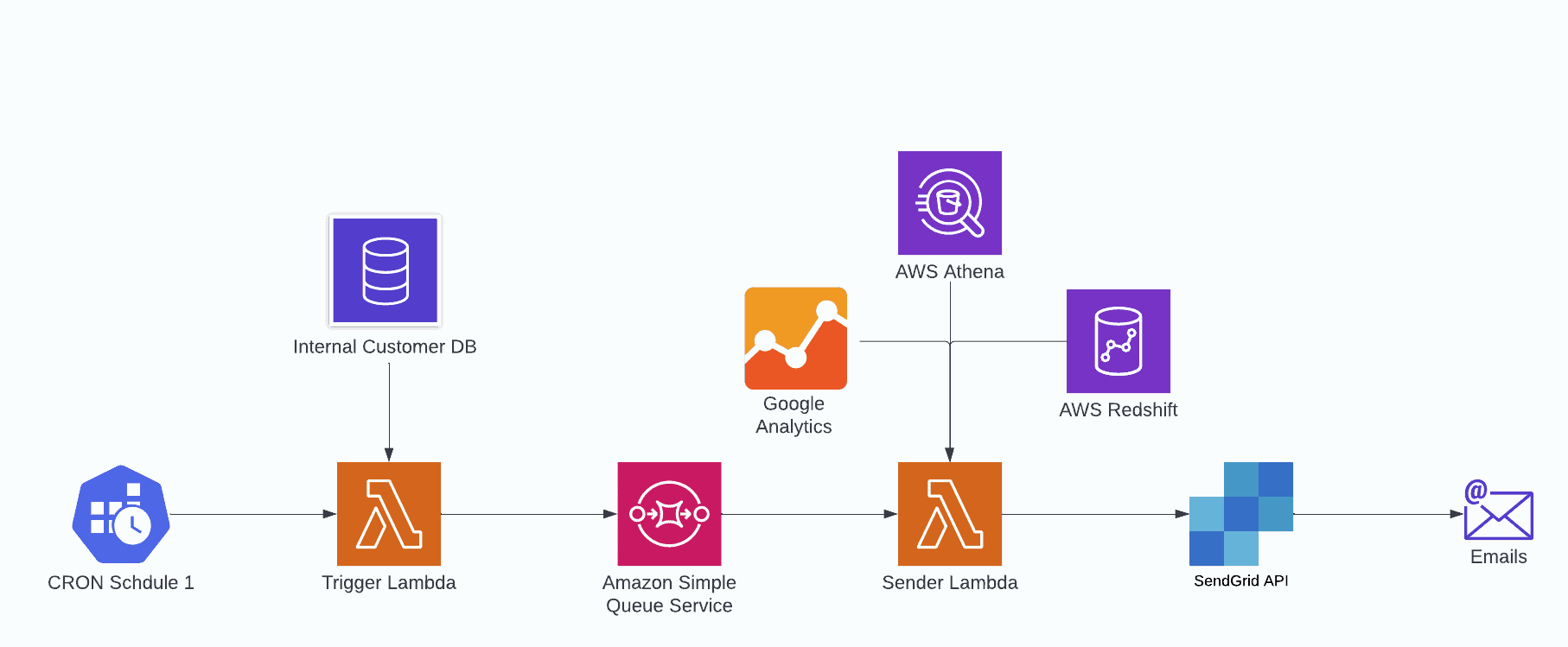
However, the team soon realized that we also desired to send internal emails more frequently than once a month so that we could perform quality assurance and data revision with ample time to detect any bugs or data discrepancies and rectify them before sending live emails. To tackle this, we introduced an additional CRON trigger to the trigger lambda and provided a “test” value that would be passed on to the sender lambda. So the diagram then looks like this:
Data Flow Revised
With the tech stack and data flow determined, it was time to commence the Development.
Development
Trigger Lambda
Let’s examine the first lambda – the trigger. This lambda guarantees that the process initiates on a schedule and includes every customer in the emails.
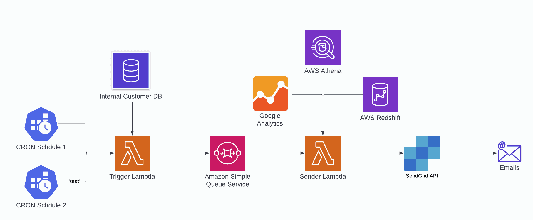
This lambda has two CRON schedules mentioned above. In the serverless config, they appear as:
As you can see, one is scheduled to execute every day at 11 AM UCT with an input of testMail: true, and another one is scheduled to execute once a month on the 5th of every month at 3 PM UCT (providing a 5-day window to catch any bugs before sending out monthly emails).
Within the function, we write our handler as so:
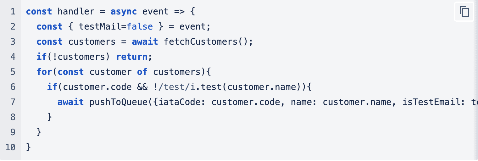
In this function, we retrieve our customers, and for each customer, we verify their code and name to ensure they are valid (excluding those with the word “test” in the name). Then, we add that customer to the queue along with all relevant information.
Sender Lambda
Now let’s proceed to our second lambda, where we perform all the data processing. In the serverless configuration, we set up a single event to trigger the lambda:

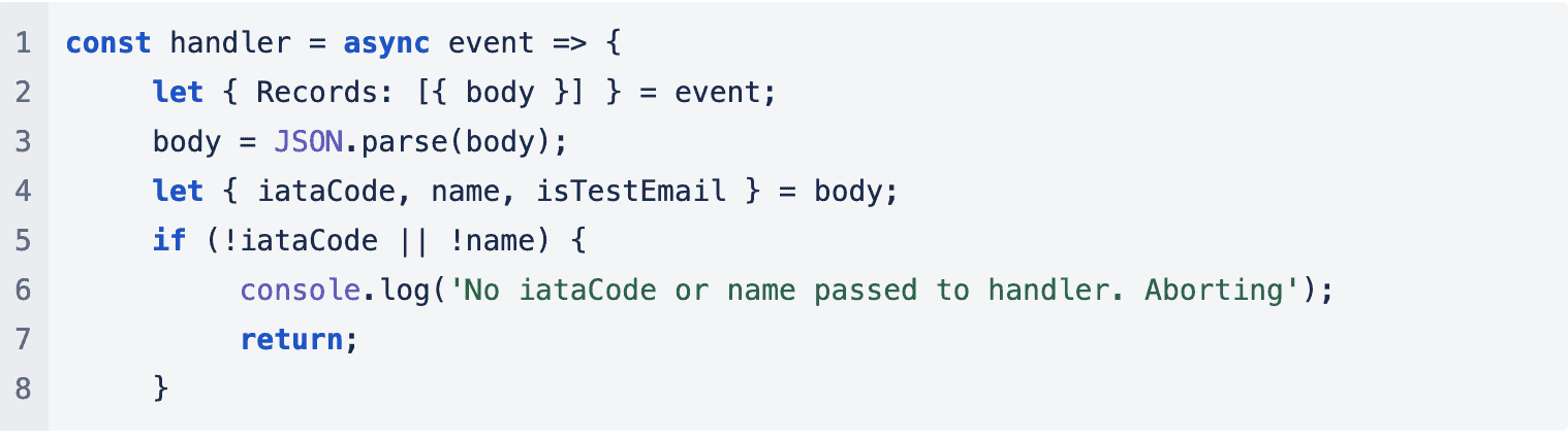
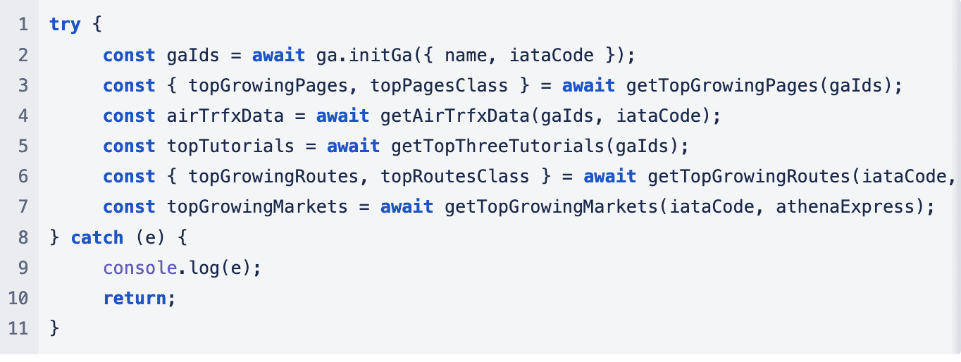
This means that when new events are pushed to the queue, this lambda gets triggered. Let’s analyze the lambda’s components. It comprises four parts: extracting data from SQS, establishing connections with the clients, querying the data sources, and constructing the email.
Extracting Data
To extract the data, we use the following code:
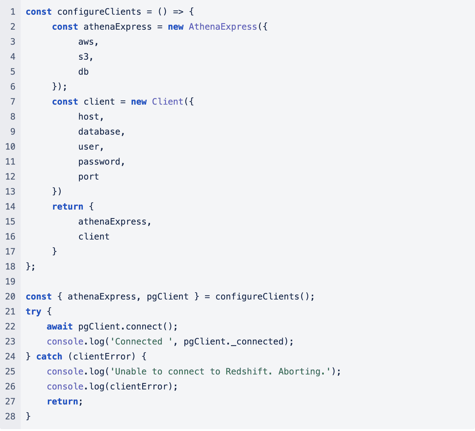
Connecting Clients
Once we confirm that we have all the data, we proceed to establish connections with our clients:
Data Collection
Then we can start collecting the data. Initially, we verify whether the client has generated enough activity to warrant an email. Our current threshold is set at 100 page views per month.
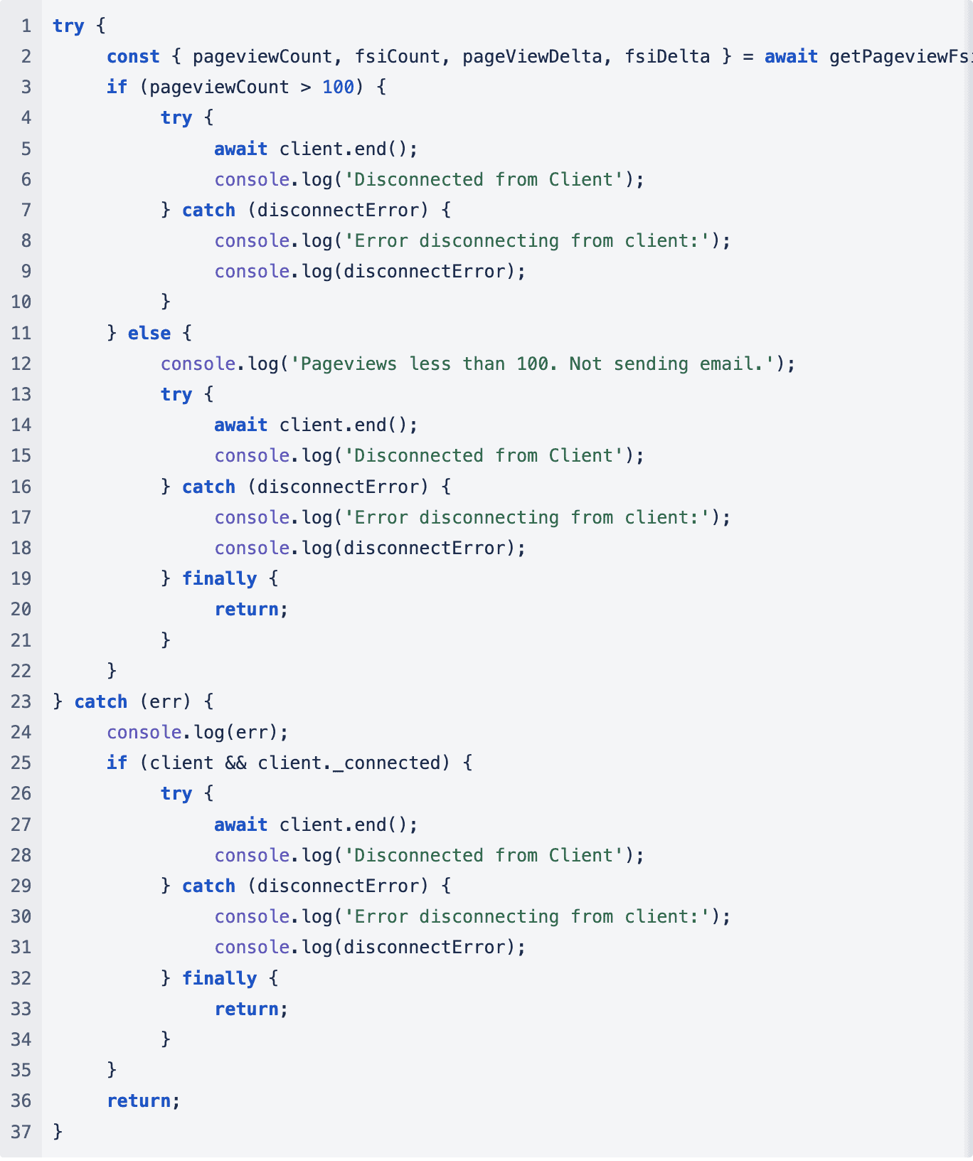
Once we’ve verified the pageview count, the team collects data from various sources.
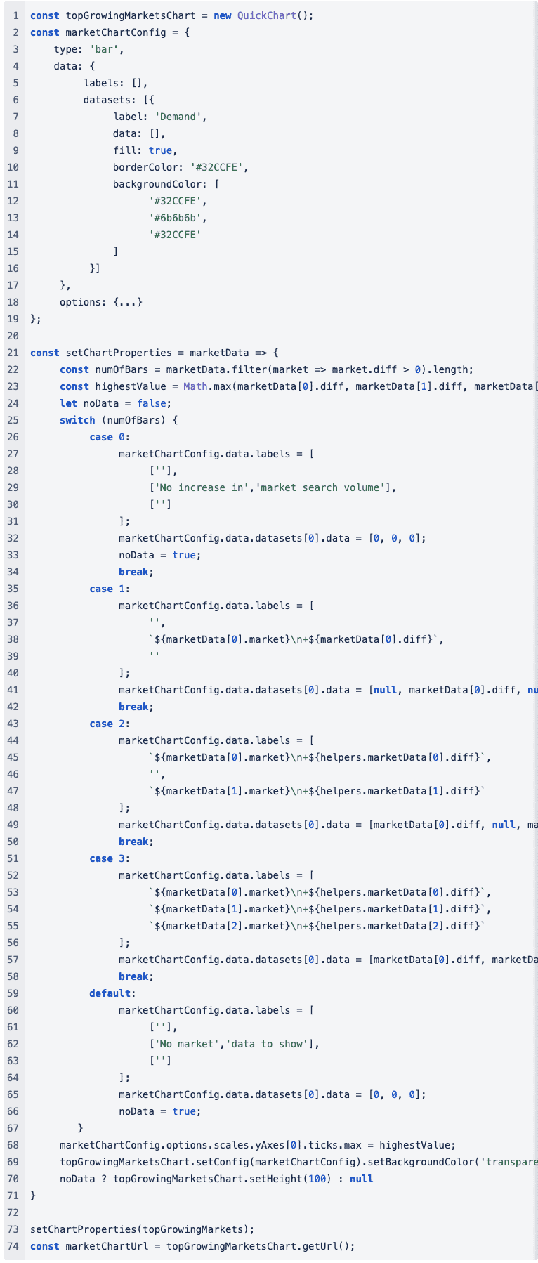
Building the Email
Once we collect the data, we can commence constructing the email. Chart.js creates the charts, and the service generates images of these charts. This service provides us with an image URL, which we subsequently incorporate into the emails.
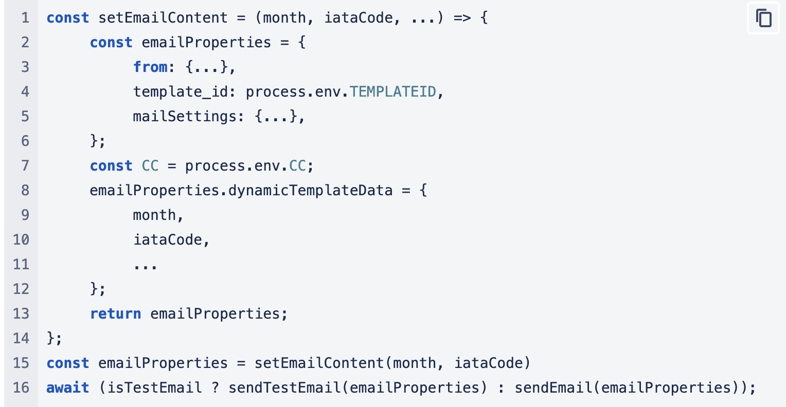
The team uses a function that puts together an object with all the data and is sent off to the Sendgrid API to process.
Conclusion: Email Hurdles and Dynamic Styling
Because we sent this report via email, we encountered numerous limitations in how we could present the data to the user. Our aim was to create dynamic and visually appealing emails, but since JavaScript was not an option, we had to rely on basic HTML and CSS. To make matters more challenging, some email providers (such as Gmail) didn’t handle CSS classes well and would strip them away when forwarding or replying to the email. As a result, many sections remained unstyled, compromising the overall layout we had planned. To address this issue, we had to embed CSS styling directly within the style attributes of HTML tags. This might not seem like a major problem, but when you want colors and icons to change based on the data, it becomes a significant challenge. Our team utilizes a function that assembles an object containing all the data and sends it to the Sendgrid API for processing.
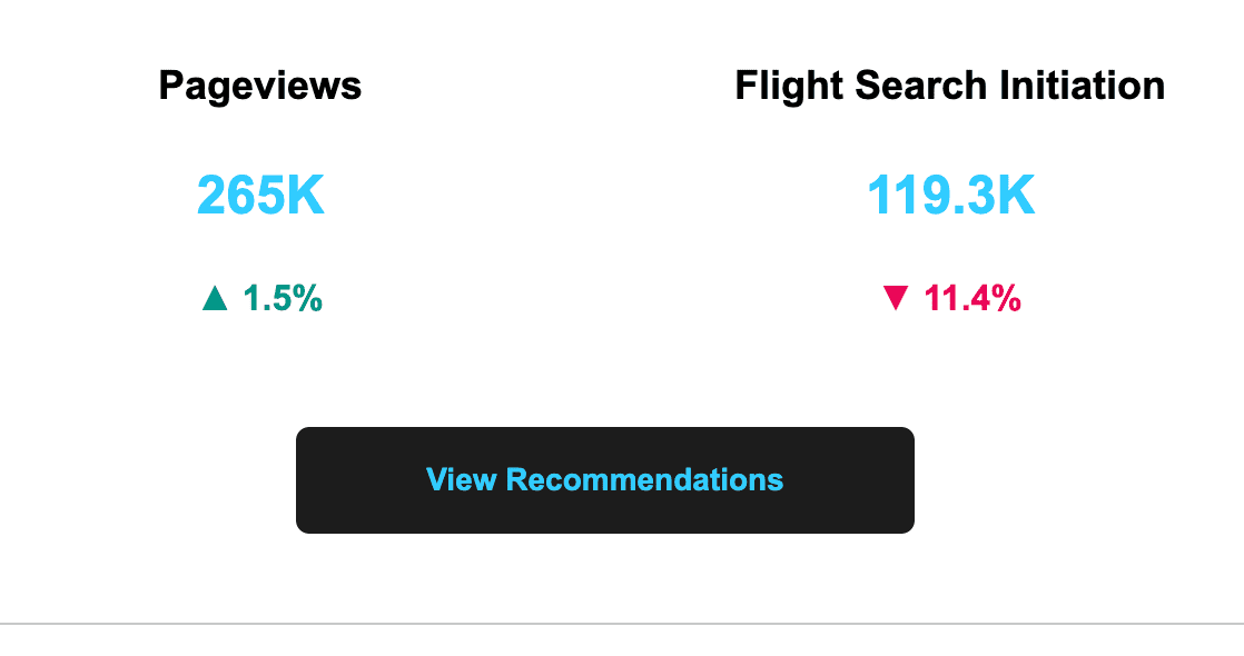 Example of colors and icons changing based on data
To solve this, the team utilized Handlebar’s HTML Escaping feature and employed an escaped block that populates with pre-generated HTML containing the correct styling and icon.
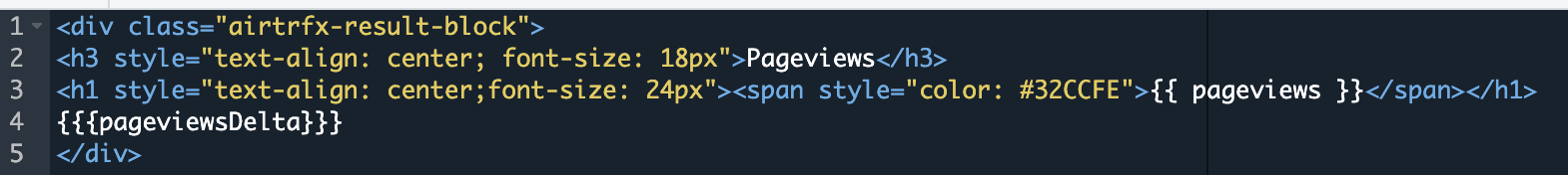
Handlebars HTML block for page views
HTML similar to the one below would then be sent and inserted in that block:

Dynamic Tables
In our emails, we frequently employ tables to display data. Nevertheless, these tables rarely consist of the same number of rows for all customers. Some tables should display only four rows, while others may need to show three, two, one, or even zero rows if there’s no data available. The issue with avoiding JavaScript is the incapability to dynamically add or remove <tr> elements from a table.
We also didn’t want to generate entire tables using JavaScript to maintain greater flexibility in case we needed to alter the design or arrangement of our tables. This took a while to solve but ended up being resolved with Handlebar’s conditionals feature and the CSS display property.
In our email template, we used handlebars if-else block on a boolean value that would first determine whether to show a table or show a text saying there is no data. If the boolean is evaluated as true, it would render the table. Each row then had an inline style for display which would evaluate to none or table-row.
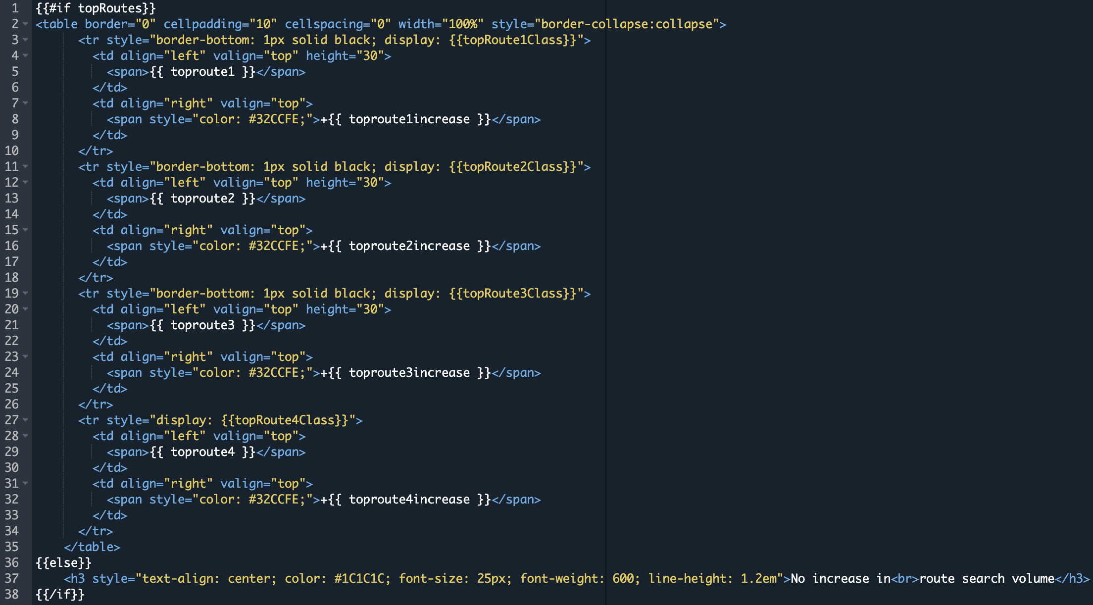
Handlebars HTML block for a dynamic table
With this, we could control which rows to show or hide or even hide the table completely and show a message instead.
Grid layouts
Finally, we aimed to incorporate a section that allowed customers to view the top 3 tutorials from the tutorials page. The team sought to achieve the outcome of placing the thumbnail beside the tutorial title. We experimented with various approaches, including the utilization of HTML tables and basic CSS styling. Regrettably, some email clients consistently disrupted the layout, leading to instances like this when forwarding or replying to the email:
Broken Layout
That’s not the most visually appealing sight. While attempting to employ the most compatible minimalistic styling, every approach we tested yielded a disorganized layout. However, during our exploration of different solutions, we found that the relatively newer flex-box approach proved effective.

After many obstacles, customers were ready to start receiving emails.
Final Thoughts
The journey of generating these emails has taught the team a lot. It has helped us spot data inconsistencies and discrepancies in our products and figure out what data is most meaningful to customers at a glance. We’re still learning more efficient ways to collect and query the data. For the next iteration, we plan to integrate with Salesforce to manage our email lists better and automate the emails even further.
These emails are currently being sent in the beta phase, and there’s still lots of feedback to gather and learn from customers. For now, we’ll continue to monitor the feedback, iterate on designs, and continuously improve how we can make data analysis more tangible for our customers.